

A badly designed tap target such as a button, link, or form field can cause users to become lost, confused, and frustrated.
If users aren’t able to find the tap target, aren’t sure what it does, aren’t able to click it, or if it doesn’t respond to the user’s interaction, then they will likely start to think that the website or app is broken or doesn’t cater to their needs.
So how do we master the art of designing tap targets, and in turn improve the overall user experience of our app or website?
Let’s take a look.
1. Write clear tap target copy
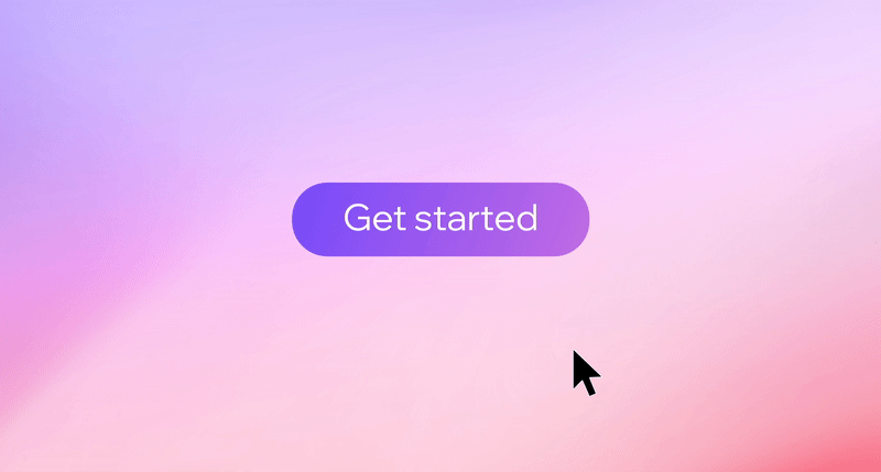
Backgrounds, shadows, rounded corners, and other visual attributes are used to draw attention to tap targets, but it’s important to remember that it’s the tap target copy that we’re bringing attention to. A tap target that successfully draws attention means nothing if users aren’t quite sure what it does.
Besides, ‘ordinary’ text links don’t display many of these visual attributes, so writing tap target copy that’s actionable, consistent, and easy to understand is one of the most (if not the most) important thing to consider when designing them.
When writing tap target copy (or any kind of UI copy, in fact), a ‘less-is-more’ approach is the most effective. This allows us to communicate directly and clearly, which lowers the cognitive load for users. Let’s take a look at a few examples.
Be crystal clear
While there’s totally nothing wrong with creating personality within an app or website design, humor is better suited in combination with marketing gimmicks, product descriptions, and so on, and not so much with microcopy. The opportunity to sound ‘different’ is rarely worth sacrificing the opportunity to be crystal clear, particularly when it comes to tap targets.
Bad example: “Grab a bite”
Good example: “Browse cafés”

Motivate users to take action
In order for users to feel motivated to interact with a tap target, the wording should ideally contain a verb (the action) and a noun (the subject of the action). This will make the tap target sound actionable and urge users to interact with it.
Bad example (verb only): “Browse” (browse what?)
Bad example (noun only): “Cafés” (do what with cafés?)
Good example (verb + noun): “Browse cafés” (crystal clear)
Optimize word count
Generally, shorter UI copy is better because that’s fewer words that users have to try to interpret, and as a result that’s less frustration and cognitive load that users are subjected to.
Bad example: “Browse all cafés”
Good example: “Browse cafés” (“all” isn’t needed)
However, the word “all” in the ‘bad’ example above isn’t necessarily bad so long as there are similar links that hint towards a specific subset of cafés (where the word “all” is the differentiator between those links). If two tap targets do (or link to) something different, then this should be obvious from the UI copy alone, so beware of shortening UI copy so much that it’s hard to distinguish from tap targets of a different nature.
Try reading UI copy over and over until it ‘feels right,’ and when in doubt try asking other people too.
So in a scenario where there are multiple but similar tap targets, the following UI copy would be more distinguishable:
“Browse cafés in London”
“Browse cafés in New York”
“Browse all cafés”
Maintain consistency
As mentioned above, it’s fair to assume that two differently-worded tap targets don’t do (or link to) the same thing, which is why if they do, then they should use the exact same wording.
Let’s assume that a tap target links to the login page of your product and its UI copy reads “Log in” — the following two examples would then be inconsistent with this UI copy and therefore confusing to users:
“Log in” (original)
“Login” (inconsistent)
“Sign in” (inconsistent)
Using “Log in” consistently results in a better user experience.
Placeholders vs. labels (and why it matters)
Placeholders and labels are sometimes misused and seen as interchangeable, but this is incorrect. In fact, they have two very specific uses and their default behaviours reflect this.
Placeholders are used to display valid examples of acceptable input, which is why placeholder copy automatically disappears as users begin to replace it with their own input. Labels, on the other hand, describe the nature of the form field, so a typical label + placeholder combination should read something like this:
Label: “Full name”
Placeholder: “Avery Smith”
Form fields that use placeholders in place of labels run the risk of users forgetting what they were supposed to type into the field. A form field should always utilize both, correctly.

2. Increase clickability by optimizing size and spacing
While the WCAG (Web Content Accessibility Guidelines) recommends that targets be at least 44 by 44px in size, Google recommends 48 by 48px. However, there’s no reason why we can’t go even larger than this, since larger targets are easier to tap and click. Fitts’ Law, written in 1954, explains that the amount of time required for a user to interact with a target depends on its size.
It’s worth noting that labels are also tap targets, so web developers will usually ‘wrap’ form fields inside the label to increase the target size, even if this isn’t visually obvious.
Fitts’s Law also states that tap targets should have enough spacing to prevent accidental mis-taps. Google’s Lighthouse audit recommends at least 8px between different tap targets.
Lastly, contextually relevant tap targets should be within thumb-range on mobile devices. While this isn’t feasible for every scenario (because of limited screen real estate), taking a mobile-first approach to design allows us to prioritize the most important tap targets at least.

3. Increase findability with better visual affordance
Affordances in UI design are visual attributes that indicate what users are able to do with an object. By utilizing well-known design conventions we can include these visual affordances and in turn help users recognize when an object is interactive.
Affordances for tap targets include shadows, rounded corners, and in the case of ordinary text links, underlines.
Icons are also important, and can sometimes even replace UI copy entirely. For example, an [x] icon might imply that an object can be removed or dismissed, and a [+] icon might imply that users can contribute or seek additional information.
Following these design conventions will improve usability significantly.

4. Establish visual hierarchy
Clear visual hierarchy indicates to users the level of importance of each tap target. As a result, this diverts their attention to the ‘right’ tap target (i.e. the one that will help them achieve their objective). On top of following all usability best practices for tap targets, we also should try to create a range of different tap target styles, some of which don’t demand as much attention. Less-demanding styles include:
Ghost buttons
Smaller buttons
Lower contrast buttons
Buttons reduced to links
Remember: when everything stands out, nothing stands out. That’s why there must be a clear visual hierarchy that we can leverage to steer the user’s attention in the right direction when needed.
Maintaining a design system is an excellent way of ensuring correct usage of visual hierarchy. This is due to the fact that designs systems help to maintain multiple variations of multiple design components while reducing the number of unnecessary variations. Winding up with too many unnecessary variations is known as ‘design debt’ and this level of visual inconsistency is definitely something that we want to avoid.

5. Don’t forget about hover states
States are used to communicate the outcome of a user’s interaction, and hover states are arguably the most common.
On desktop, web browsers indicate that a tap target has been hovered over by automatically switching the cursor. However, on mobile devices, hover states don’t work quite the same way due to the lack of a cursor.
So does this mean that we shouldn’t care about hover states?
No, we should still care about hover states, both on mobile and on desktop. A little extra affordance when it comes to interacting with tap targets never hurts, although it’s not worth the effort of designing different hover states for each type of tap target. A quick but effective one-size-fits-all solution is to increase the brightness upon hover — this microinteraction works well regardless of the color of your button or text.
On mobile, the equivalent of hover states are ‘active’ states, indicating that a button is currently in use. Therefore, a change in brightness should be noticeable even if the tap target is mostly hidden underneath the thumb (which is another terrific reason to make tap targets larger, by the way).
6. Don’t forget about focus states, either
Focus states apply to all mobile and desktop tap targets navigated to via a keyboard or screen reader. Without a mouse cursor indicating where users are on the screen in realtime, focus states indicate which target is currently selected as users ‘tab’ through them.
Focus states also become apparent when the document switches focus dynamically, or when an interactive element that expects user input (e.g. a form field) is selected. By default, devices and web browsers offer their own focus styles, which are instantly recognizable to those that navigate using keyboards and screen readers.
While you may choose to design focus states yourself - taking into account web accessibility guidelines - a good practice is to leave the default version enabled, instead letting devices and browsers implement their own styles.
Conclusion
Sticking to design conventions is important.
Why are links underlined? Who knows, but we’ve come to understand that underlined links are clickable because that’s been the convention for as long as webpages have existed.
Other design conventions, such as the use of button shadows, make immediate sense. After all, buttons are three-dimensional in real life and three-dimensional objects have shadows.
If we stick to the design conventions talked about in this article, we can ensure that tap targets — which are arguably one of the most important aspects of any user interface — are noticeable, understandable, actionable, tappable, and clickable.
.jpg)


