

Pretty much all of us (rightly) expect to find our way easily around any site.
In fact, effective navigation is a top factor in making or breaking user experience online, according to a review published in the Online Journal of Communication and Media Technologies. Navigation menus are arguably the most ubiquitous feature on the internet. And of all menu types, the horizontal menu is the one we see most often, especially on desktop. But just because they're expected doesn’t mean they have to be boring.
On Wix Studio, you can add horizontal menus and design them with a wide range of customization options. But it’s up to you to make it your own. Here, we dive into a few best practices to keep in mind, and six ways you can style horizontal menus beyond basics.
Add some impact with Wix Studio's horizontal menu capabilities.
1. Make sure menus do their job
Style isn’t a top priority when designing site navigation menus, and for good reason. Users need a smooth navigation experience. No matter what you do to amp up a site menu, there are a few things to keep in mind:
Make sure the menu is easily visible and readable, with enough visual weight and contrast between the links and background so that all users can read it.
Place the navigation menu where users can find it. Users generally expect to find it where they’ve seen it on other sites—at the top of the page, in the left sidebar, or at the bottom on mobile for example.
Avoid overloading your menu with options or creating a cluttered design.
Users should be able to interact with the menu easily so make sure it’s big enough to click on.
Consider adding interactions and visual cues to help users understand where they are on a site and help them navigate.
For pages with a long scroll, you may want to create a sticky menu that stays on screen.
There are lots of options out there besides the well-known hamburger menu. Once the experience is as smooth and clear for the user as possible, there are a few ways to make them interesting and exciting.
2. Go bold
Horizontal menus don’t all need to be flat and minimalist. You can use subtle shadows to add depth, incorporate brand colors, gradients or prominent fonts to create an eye-catching header.
Take book publishing company Publishing Partner, for example. It injected the brand into its navigation menu with strong fonts and fun colors that stand out against the overall design. When looking for somewhere to enhance branding with aesthetics, the menu is a subtly ideal spot.

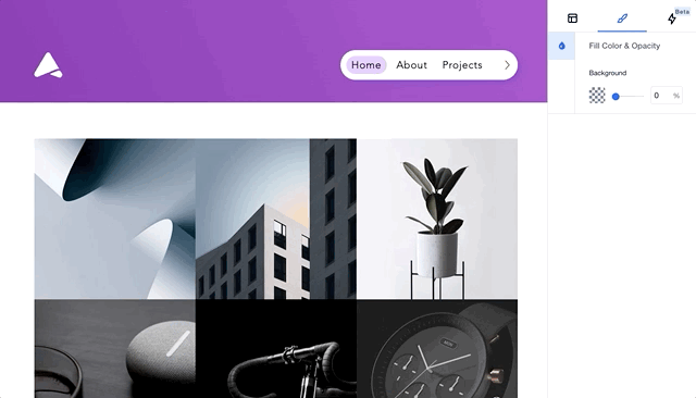
How to add a menu in Wix Studio.
3. Signpost with style
Whether you’re hiking mountain trails or exploring a new city, the most useful maps have a “you are here” pin to help you orient yourself. Since navigation menus are the map of your site, adding signposting to help users understand where they are improves their experience. Graphic designer Tony Wiley uses a bright pop of color and a wavy underline, which is a design motif used throughout his site, to indicate the selected menu item and help site visitors easily see which page they’re looking at. Even on a site with few pages, it doesn’t hurt to put a stylish pin in the map for users.
4. Add interesting interactions
The navigation menu is a great place to add some small interactions. Doing so serves two purposes: to signal that the links are clickable, and to create an engaging experience on a site. That’s exactly what urban art space The LA Art Box did with their site menu, with each item sliding up and down with a “slot machine” effect on hover. Adding hover interactions to menu items can help make a site more engaging and encourage users to navigate from page to page. (Related: How to use our custom CSS to take your client sites from good to great)
5. Think strategically about placement
While users shouldn’t have to go looking for it, there might be a good reason to change up where you place a nav bar. For example, Maison Simonne-Monet-Chartrand, an organization supporting survivors of domestic violence, made navigation the center of its home page. The organization understood that its audience might have limited time to find the resources they need, so they are immediately presented with 3 intent-based options to lessen the time it takes to understand and decide which page to choose.
With good reason, changing up the placement of a navigation bar can help enhance user experience by prioritizing their end goals on the site.
6. Focus on the end goal
As previously hinted, keeping a navigation menu minimal is a great way to direct users toward a single goal. For example, eyewear brand Nueva Sunglasses removed some of the usual pages such as their about page or blog from their primary navigation, instead directing users to their shop, cart or login page. When something like sales is a priority, it can help to style the navigation simply and focus on where you want users to go. Guide visitors to the pages you want by emphasizing them with anything from bright gradient backgrounds to bold borders, using styled horizontal menus on Editor X.

