

Gradients used to be considered a clunky shorthand reference to the kitschy ‘90s era of the internet.
Re-popularized over the past few years, they now convey any story you want them to tell; a subtle and sophisticated means of transporting users across pages and moods. It’s yet another proofpoint for that old cliché, “what’s old is new again.” Gradients are back in the design zeitgeist—but this time amped up by new tech capabilities and web design end uses.
The trend is everywhere: In banking, with Buck design’s cash app campaign (one commenter even referred to it as “sexy”!). It’s in music streaming, courtesy of Studio Gradient’s campaign for Spotify. It also in more expected arenas, bringing a certain amount of zen energy to the wellness space, like with this yoga studio website and branding by Pentagram.
Not to be outdone, Wix Studio has its own section background gradient capability, so you can integrate rich, complex section background gradients into your next website with creative coding, using live CSS for a more fluid workflow.
Using the editor, you can now create linear, radial, and fluid (a mesh-like version with specific color points) gradients. All of these "subtly lead your visitors’ eyes and attention toward a specific area of your website or light a piece of content," says Adi Huri, creative product manager for WOW, Wix's Visual Innovation Team.
These gradients kick things up a notch. They flow through different tones, add depth to flat designs, can spotlight specific sections, and can give media a new look by dropping an image’s opacity and placing a gradient behind it. And with unlimited color stops, you have complete control—without affecting site performance. Gradients “can be fun and edgy but they can also be more delicate and elegant,” says Huri. It’s really up to you.
Adds Wix Studio research & development designer Amit Asulin, “a gradient's role is to tell a story, from point to point, color to color, value to value.” Start a color story of your own using these six examples of how to integrate gradients—straight from the Wix Studio design team.
1. Color-changing background gradient

You can give users the impression that background colors are changing before their very eyes with a background gradient scroll. Wix Studio brand designer Eliran Vahdi used the technique to draw the user’s eye down the page as they scrolled past an abstract hourglass shape in the 2022 mid-year digital design trend report, pictured above. The colors change as the user scrolls down the page, until the title and a gradient button.
Vahdi used the gradient on a long section with a sticky element to give the feeling that the colors change as the user scrolls, to make “the whole section feel interactive and unusual,” he says. No matter how you use it, Vahdi adds: “Make sure it sits well with your concept and use it smartly.”
2. Radial gradients with slide navigation
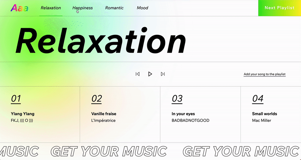
Wix Studio designers Shir Berkovitz and Noa Sela punctuated their conceptual music streaming platform with radial gradients that change color to convey the mood of each playlist, using a purple and red radial gradient for romantic songs and yellow and green for relaxing ones. “The goal was to produce a playlist according to different types of feelings,” explains Berkovitz. “Every time you change the playlist type, the gradient changes accordingly.”
Sela and Berkovitz achieved the effect by using a background gradient with a white mask above it. What’s their advice to fellow designers? “Think about the story you want to tell,” says Sela. “A gradient can be a great tool to tell a story and convey emotion.”
3. Multiple gradients within grids

If one gradient per fold doesn’t satiate your color craving, you can also use multiple gradients within a grid. Take this example, which mixes both linear and exclusive fluid gradients in various sections to create a sense of movement.
“The goal was to test the combination of both the grid and the gradient tool,” says Berkovitz, “which turned out to be a fun and successful combo.” Rather than importing an outside image, the designer created the fluid gradients directly in the web builder, which allowed for more flexibility and saved time.
4. Linear background gradients

For this social post celebrating Pride Month, Wix Studio designer Anita Goldstein applied a linear background gradient across a year-long calendar. The gradient, which uses rainbow Pride colors, is applied here to convey the idea that pride shouldn’t just be celebrated in a singular month—it should be celebrated all year long.
The gradient also has a practical purpose, creating a transition that draws the eye down the composition. Goldstein’s approach to gradients is pretty intuitive. “Enjoy and have fun with it,” she says, pointing out that the background gradients tool “opens new possibilities for high-quality image-making within the editor itself.”
5. Gradients for the Jack of all trades
Wix Studio designers Hadar Yamini and Chen Rozen put background gradients to the ultimate test by testing all the options they could for horizontal and vertical sections. Here, they created a site that showcases four different gradients built in the editor, by using the multi-state box to create a layout that uses a repeater, but can break the repeating layout. (Related: a guide to good website design.)
6. Gradient focal points
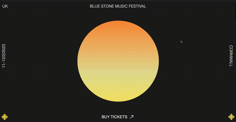
Wix Studio designer Linor Pinto created a conceptual music fest website that puts the musicians front and center with a bright gradient framed within a large circle. The vivid mandarin orange gradient also has another purpose: conveying the idea of the sun rising and setting on a day-to-night line up.
“The goal was to create the lineup for the event according to the time of the day from noon until night, and the gradient's colors were designed accordingly,” explains Pinto. Pinto also used an SVG mask over the gradient, so users see the colors change through circular peepholes on the page as they scroll. According to Pinto, effective use of this treatment is ultimately about using gradients thoughtfully, applying color combinations to tell a story.
.jpg)


