In 2022, designers aren’t restricting type to two dimensions.
3D lettering is breaking type free of your design book’s kerning and leading, and is being used as yet another way to catch the eye of users. Sure, three-dimensional, expressive lettering has popped up on the web in some form over the decades, but not like this (and not nearly as often).
The shift toward gooey, metallic, three-dimensional, sometimes illegible typography is a continuation of a larger expressive design trend we’ve seen emerge over the past few years. Led mostly by tech start ups, staid corporate minimalism and humanist sans serifs dominated branding from the mid-aughts until the mid-2010s.
That was strategic on the part of tech companies: without a pointed personality or visual brand, tech companies could reach the broadest audience possible. Friendly, approachable sans serifs and clean visual identities make an ideal carte blanche on which to build consumer trust and convey transparency when you’re lacking corporate history and maybe even a long-term business plan.
Images courtesy Alex Valentina.
Then it didn’t seem so authentic anymore. “Soon it was everywhere, applied to everything, a blank slate upon which a user could project anything they wanted,” wrote Perrin Drumm of the broader expressive type trend. “Inundated with empty-feeling brands targeting our feeds with promises of smoother skin, healthier gut flora, workout gear that will actually work this time, and ideal romantic partners all just an easy geometric sans-serif button click away, it's no wonder we all want out.” Scrolling our feeds and trapped in our apartments peak-pandemic, nothing felt more stale.
The evolution of type from practical letterforms to three-dimensional decorative design elements is occurring across industries, too, including ones you might not expect. In 2022, Eddie Opara and his team at Pentagram launched a 3D logomark for the Mellon Foundation, which morphs into various colors and organic shapes. Designer Kushagra Gupta transformed the song title "Home" from simple line item into a bulbous, color-shifting design centerpiece.
More on making the most of typography.
Typeset a mood with the spookiest type in pop culture, from 'Psycho' to 'Suspiria'
Get in on the psychedelic design trend with these groovy typefaces
Make online feel offline with one of these handwriting fonts
Establish a baseline: Know the difference between typefaces and fonts
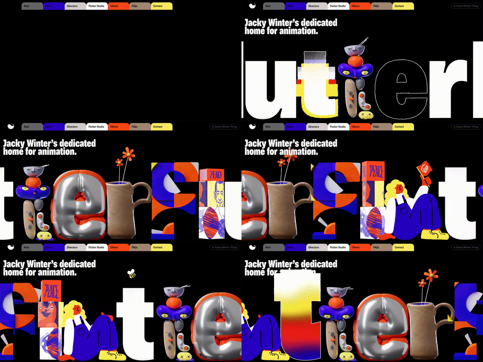
Animation production company Flutter showed off its expertise with letters that morph into different aesthetic styles before a user's eyes. BMW used goopy, liquidmetal letterforms designed by Alex Valentina, and graphic designer Lynn Cariou worked with Studio Nari to give Charlie XCX’s hot pink wordmark an embossed, metallic vibe. (Related: See how K-Pop designers are using type to stand out.)
Image courtesy Kushagra Gupta.
Of course, some forms of 3D type have been around for years, remembers Pentagram partner Eddie Opara. But the way we navigate the web is changing, in part due to the metaverse. It goes without saying that the lettering designers use to communicate within new contexts will change with new capabilities, too.

Image courtesy Jacky Winter/Flutter.
“I recall as a child seeing the extraordinary Channel 4 ident designed by Lambie-Nairn (in 1982)––the first use of 3D type on a screen that I’ve ever seen,” recalls Opara. “It was absolutely mesmerizing, and they’ve kept it going for over 30 years. Now we’re on the cusp of the ‘metaverse,’ and finally breaking free from the vertical scroll. How can we not be excited to think about a universe that’s more open to 3D design, including lettering?”


.jpg)
.jpg)
